Web design | Interaction design | UI design
February to March, 2024 (6 weeks)
Sole designer, responsible for UX and UI design
1 Product Manager, 1 Frontend Engineer, 1 Backend Engineer, 1 QA Engineer, 1 Technical Writer
Treasure Data has the leading customer data platform (CDP) product, which were mainly used by marketers to create personalized marketing experience for their customers.
Segmentation is the process of dividing a large group of potential customers into smaller, more manageable groups based on certain characteristics so that businesses can target their marketing efforts more effectively. A segment is a group of customers.
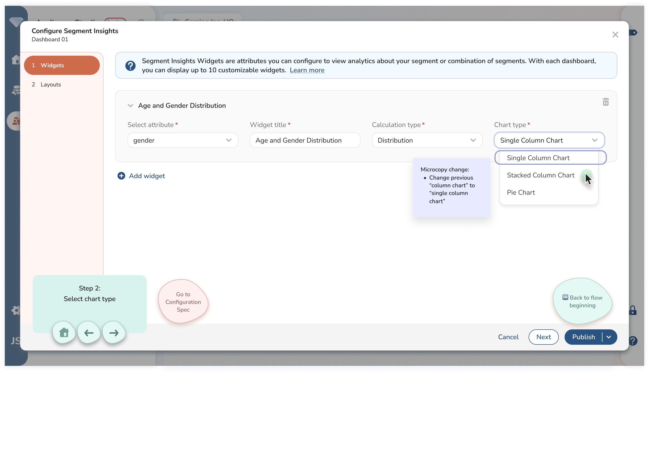
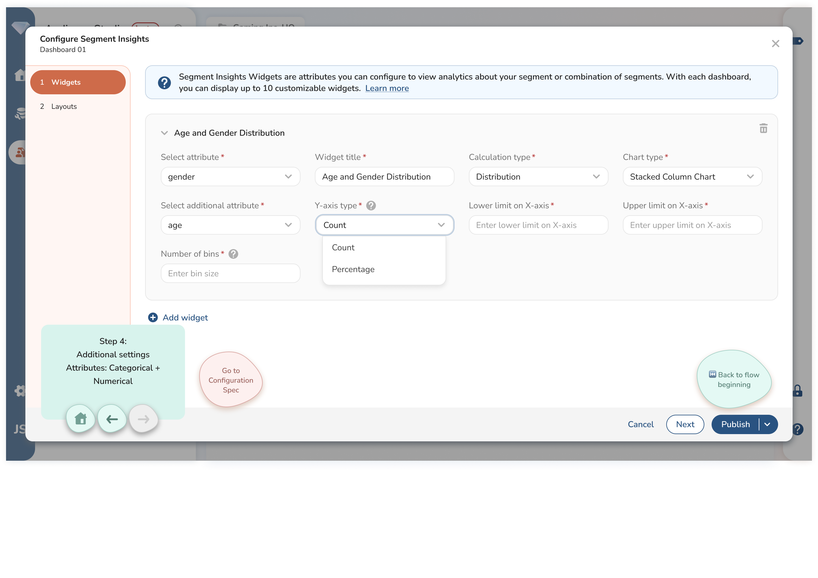
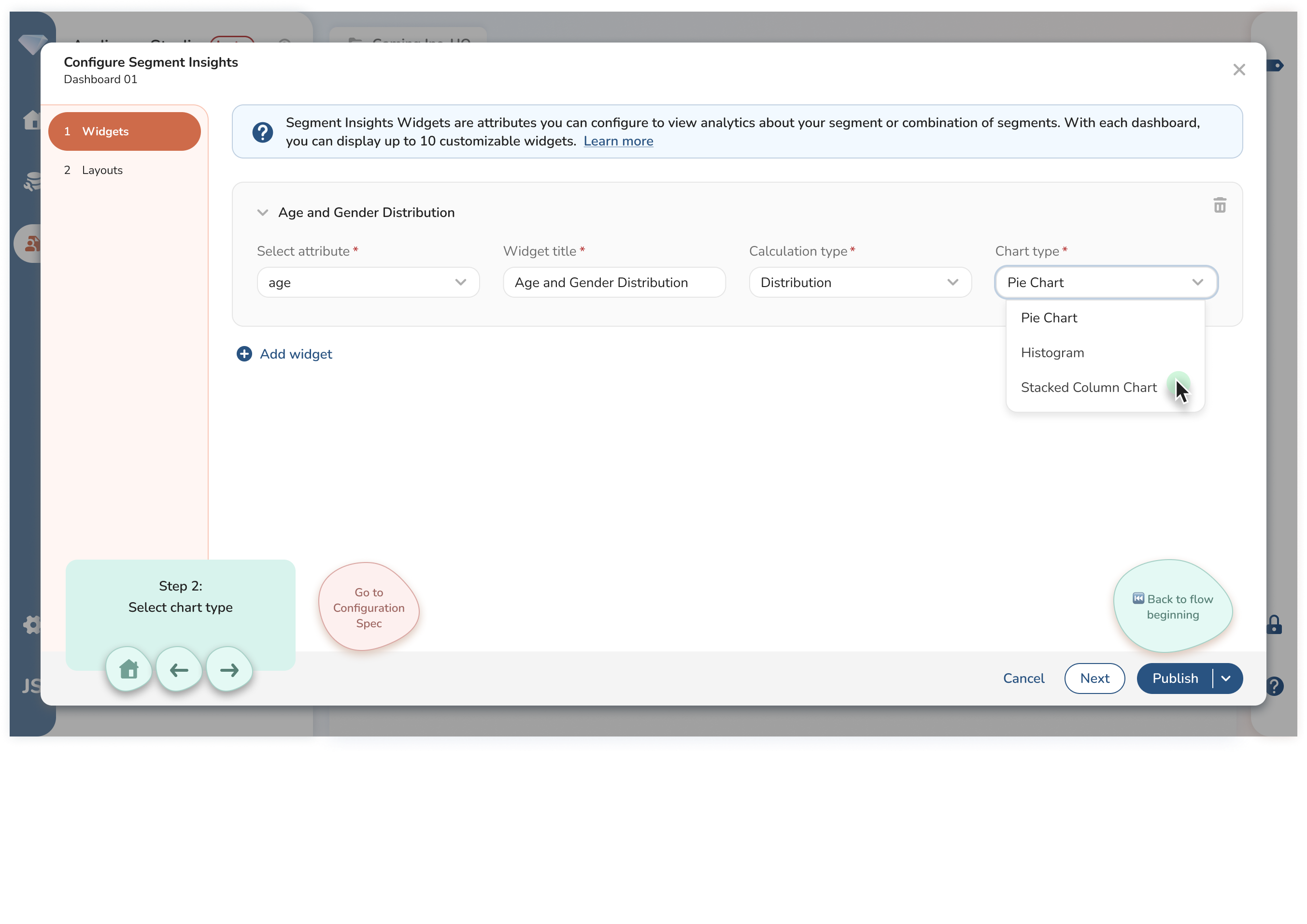
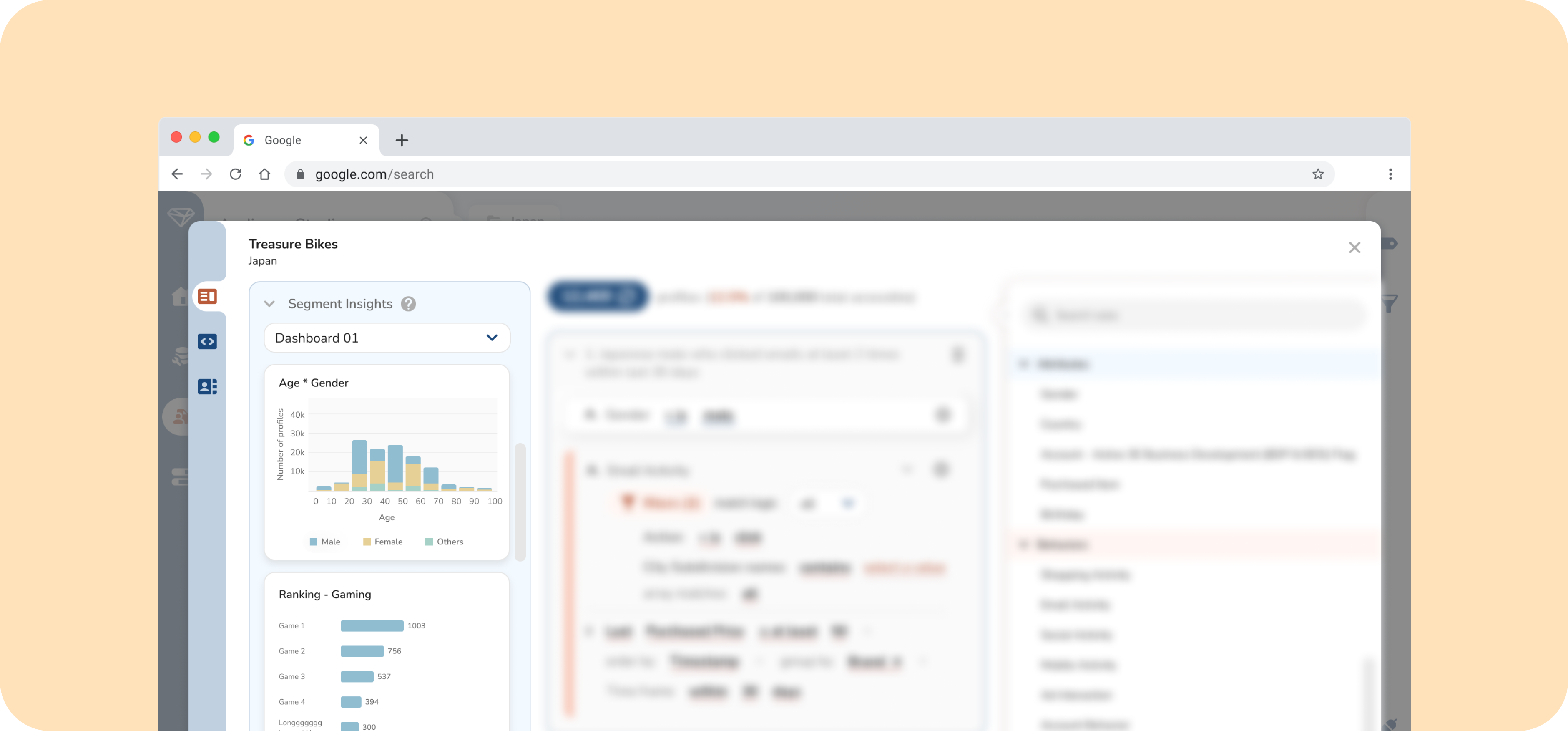
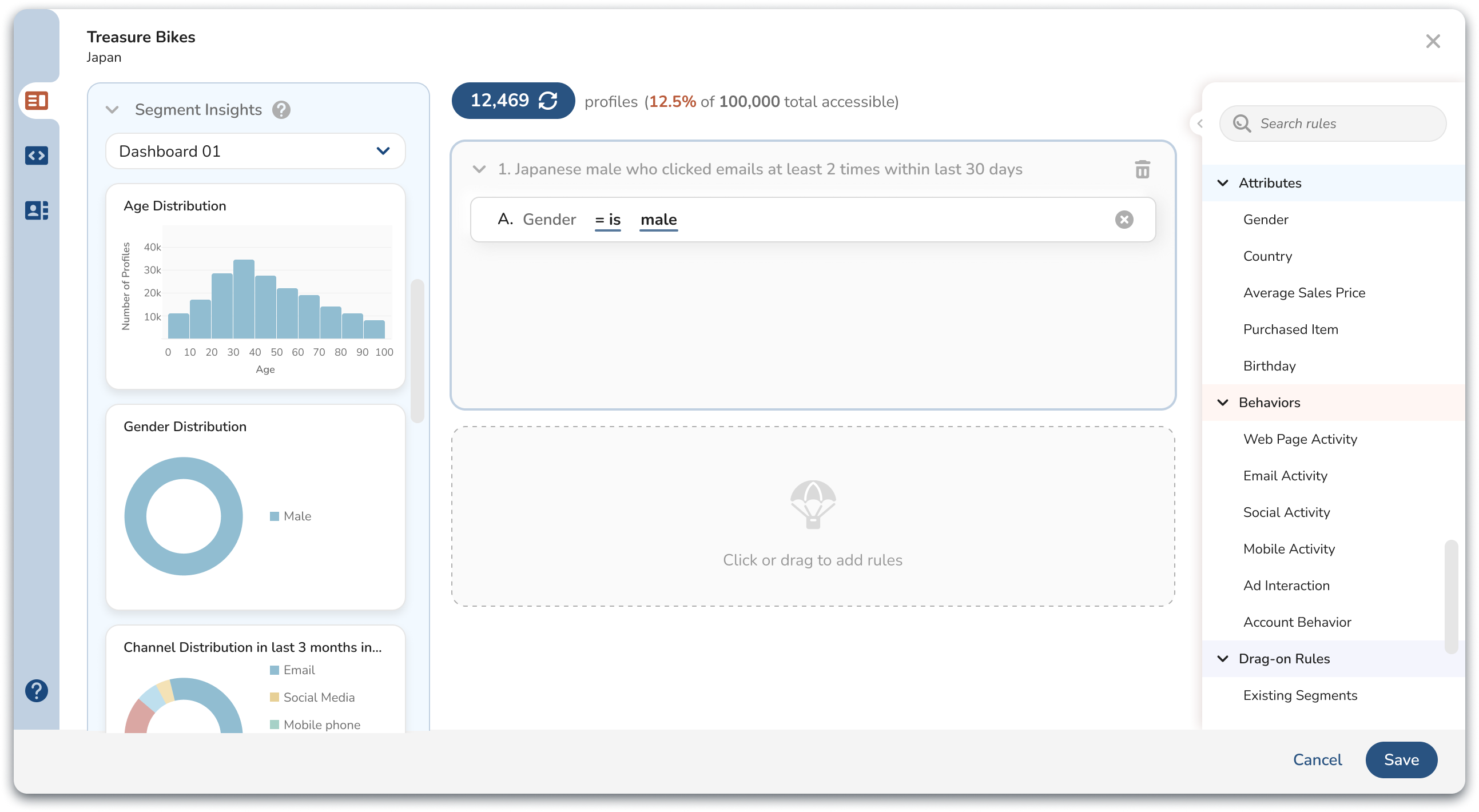
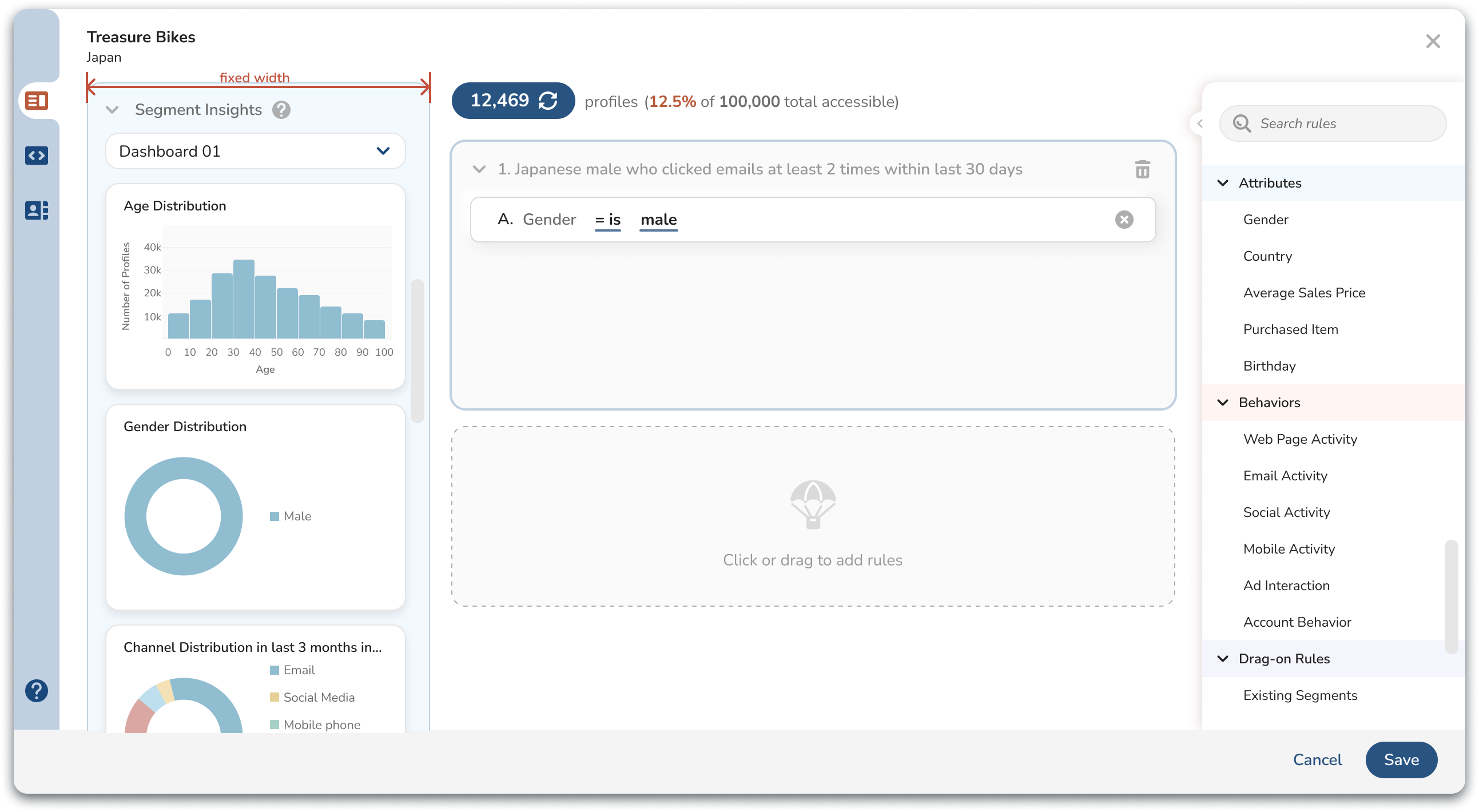
Segment editor is the tool to create segment. Segment insights is part of segment editor that provide insights about customers when marketers create segments.
Segment insights feature has two components.
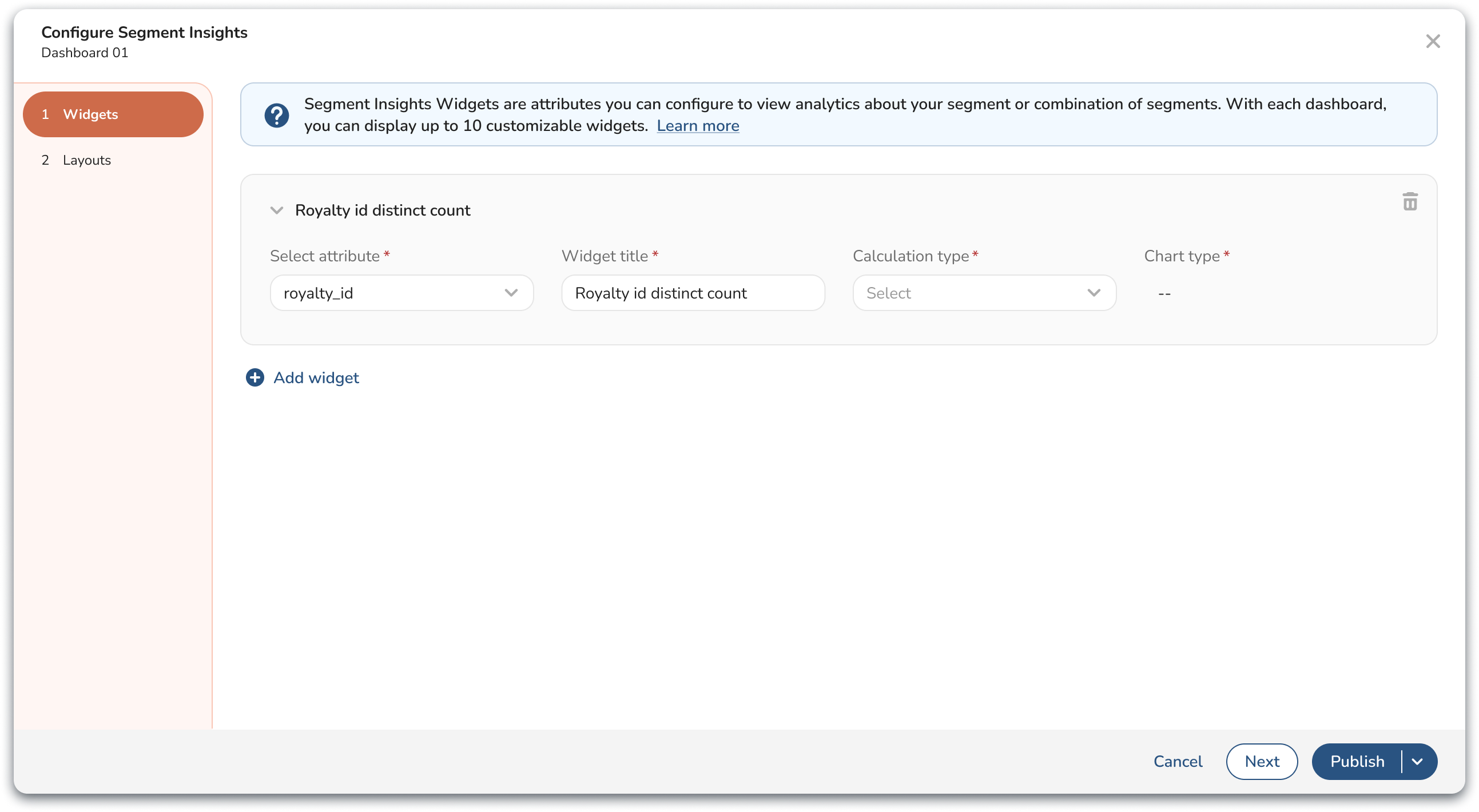
First, user configure insights charts.
Second, user see charts while creating segments in segment editor which provide them insights about their customers.
When I took over the Segment Insights project, Milestone 1 of this feature had already been shipped.
After collecting feedback from customers, we prioritized the following as the project goal for Milestone 2:
Limited space on segment editor UI to display charts. Panel cannot be expanded.
I start off by discussing customer’s ask with the Product Manager.
Customers asked for three types of additional charts:
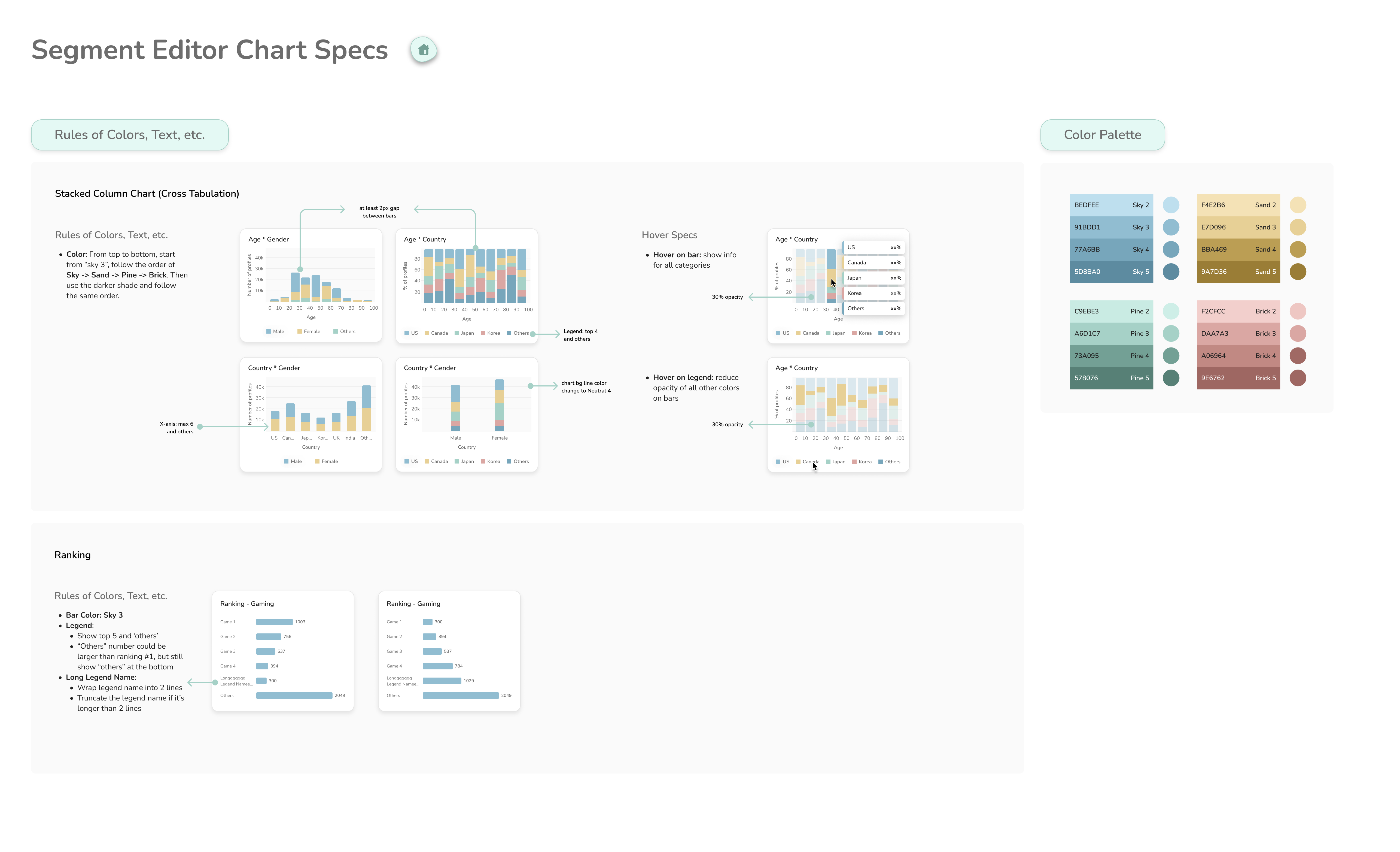
For cross tabulation chart, the use case customer provided is they would like to see data visualization for age * gender distribution.
There are several types of cross-tabulation charts, including Stacked Column Charts, Clustered Column Charts, Heatmaps, Tree Maps, and more.
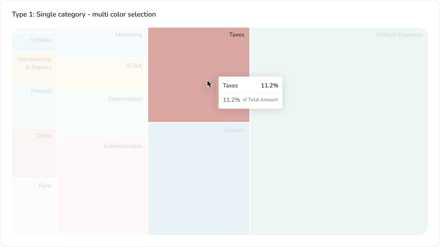
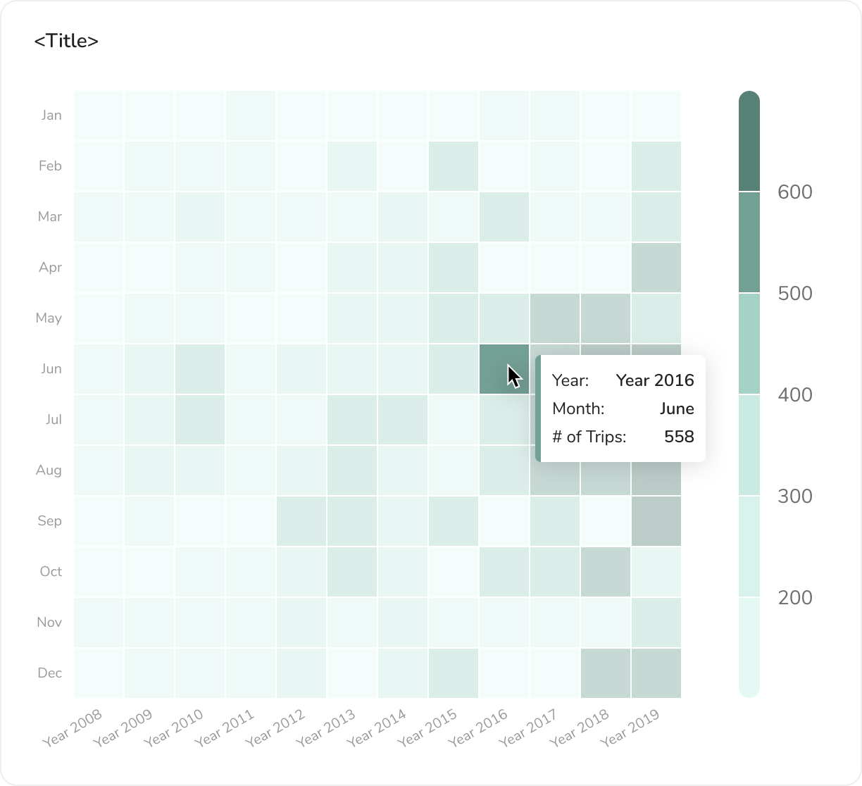
👎 Tree map and Heat map are difficult to display on a limited space. They are also not the best chart type to display the data customers asked for.
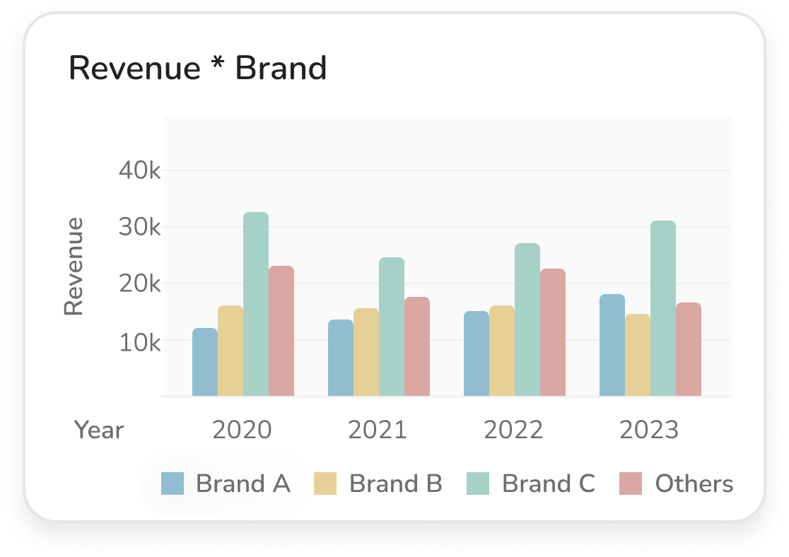
👎 Clustered bar chart can fit into the limited space. But will have viewing issue when displaying data across more than 4 years.
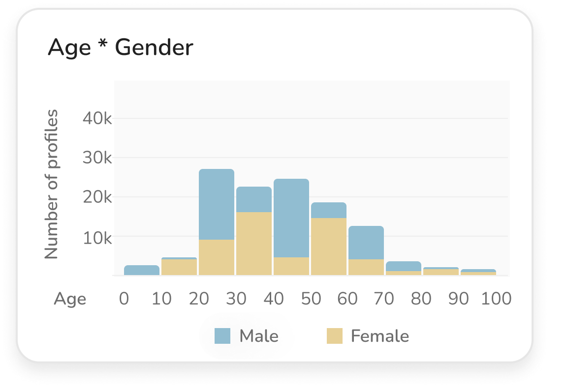
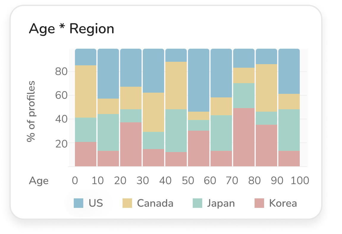
👍 Stacked bar chart is the most appropriate chart type.
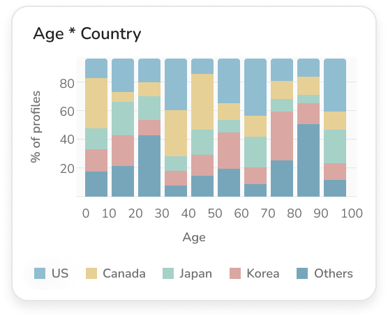
Display limited numbers of category, use “others” to display the rest