
Web design | Interaction design | UX Research
Redesign an internal-used web application
Lead UX designer and researcher
As a company famous for providing fair and valid assessment, ETS has a set of sophisticated rules about how human scoring is conducted for high-stake assessment such as SAT, TOEFL, and GRE to guarantee quality and equity.
The Research Department of ETS continuously conducts research projects to evaluate and improve the rules of human scoring. CRISP is the web application where researchers conduct these types of research projects. It was internally designed and developed by my team.
As the lead UX designer/researcher of this project, I defined the end-to-end design process. My responsibilities include:
I am very proud of my work on this project because I was able to overcome the following challenges:

CRISP has 3 different portals for 3 types of users. The Chief Scoring Leader plays a crucial role in a human scoring project and involves multiple sophisticated workflows. The following case study will focus on how I redesigned the Chief Scoring Leader portal.
Now, before diving into the design process, let me show you the before and after of CRISP Chief Scoring Leader portal design.
A seamless onboarding experience to clearly show the steps needed for setting up a human scoring project and guide novice users through the process.


An intuitive and flexible design to help users set up the scoring labels that fit the needs of their project.
A dashboard design to provide users with the information they need to monitor an ongoing human scoring process.
When I was first assigned this project, I was told to "Improve the usability, look and feel of CRISP so that it is more user-friendly for non-technical users", but I have no idea what that means.
I think the first thing I need to do is to gain some domain knowledge. So I did some research and here's some high-level understanding of how human scoring works.

There are three types of users involved in a typical human scoring project. They each have a different portal in CRISP.
There are two phases in a typical human scoring project. Only Chief Scoring Leader is involved in the first phase to set up a human scoring project.
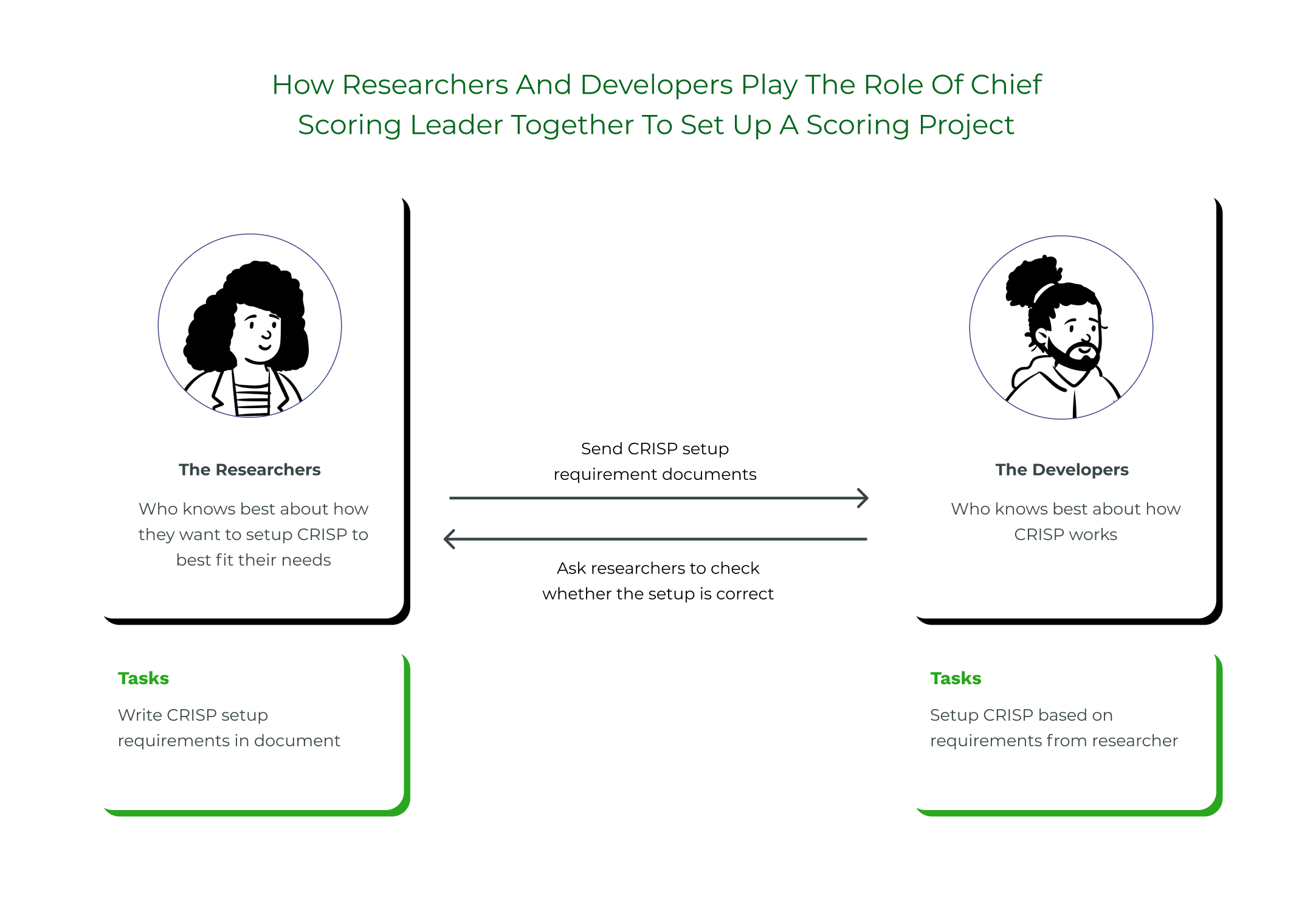
In CRISP's previous design, the Chief Scoring Leader portal was designed more like a back-end platform for developers, so the researchers and the developers on my team have to work together to set up human scoring projects.
It has become more and more obvious that the above workflow is not efficient for both the researchers and developers. The pain points are:
Because of the above reasons, need arises to redesign CRISP so that non-technical users like the researchers can use CRISP's Chief Scoring Leader portal to set up human scoring projects by themselves.
So now I have gained some domain knowledge. And it is clear what I need to achieve with the redesign. I realized there are still some gaps I need to understand before I can flesh out the whole experience.
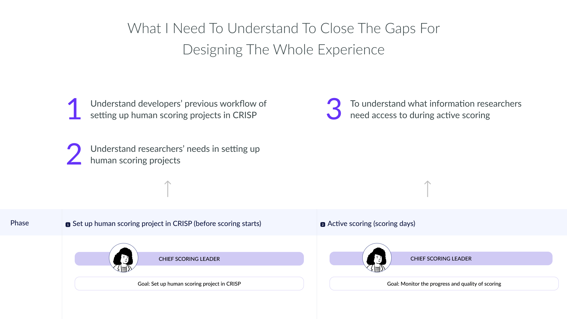
Based on what I need to understand, I took the following approaches.
Having a clear understanding of the current workflow of CRISP will help me identify the high-level information architecture, specifically for setting up the scoring project part.
Based on my previous understanding, I created cards that represent different tasks for setting up a scoring project. Then I asked our developers to put them in order to see if any tasks can happen in parallel. Meanwhile, they can add any missing tasks if necessary.
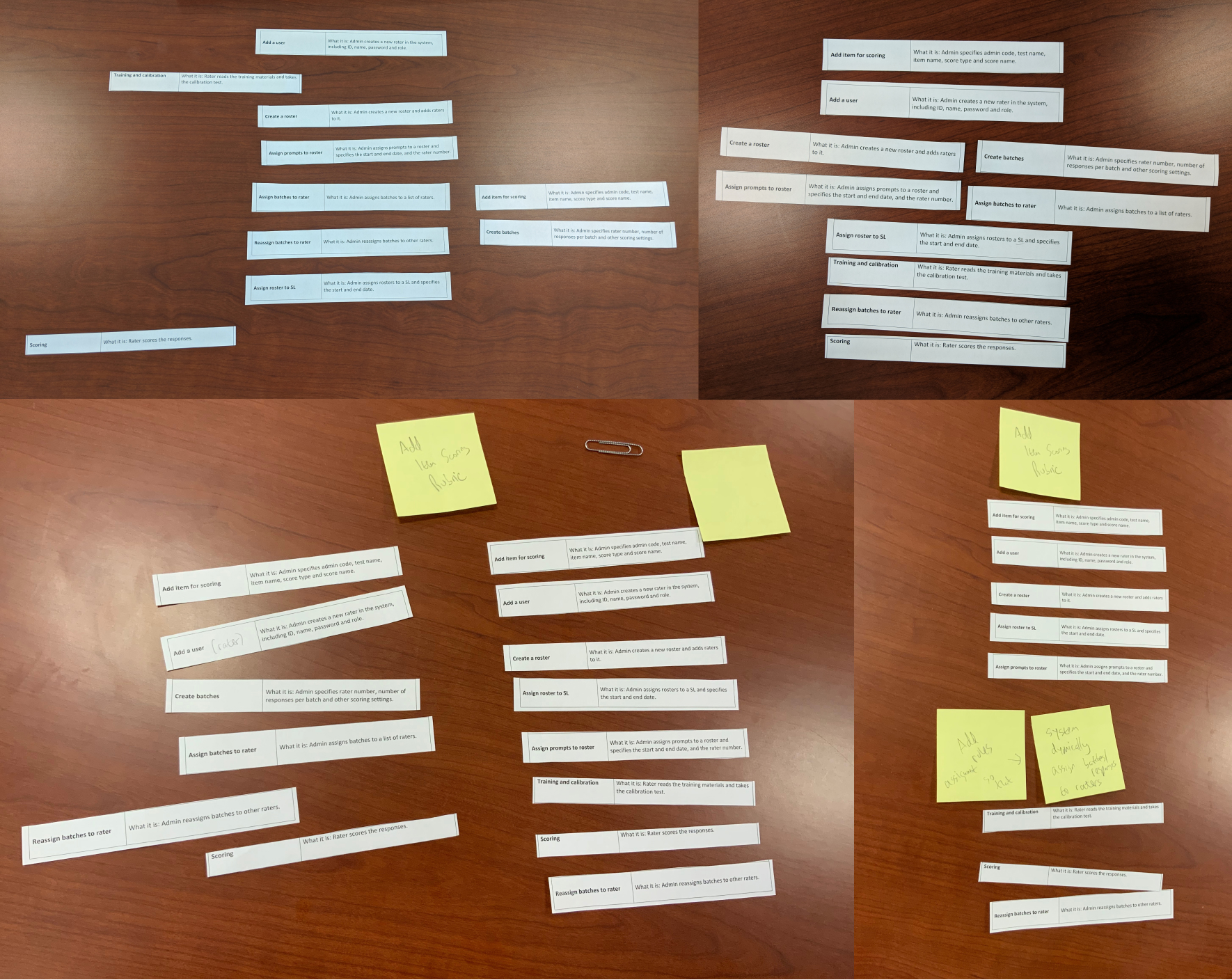
I also interviewed our developers who have previous experience working on human scoring projects to understand the overall workflow between different types of users, such as what tasks each type of user needs to do, how do they interact with each other.
I then designed the high-level workflow and information architecture based on card sorting results and interview data.

Since researchers have never used CRISP to set up scoring projects before, I designed the instruction page to guide novice users through this sophisticated process.
Because researchers will be the main users of CRISP's Chief Scoring Leader portal, I interviewed them to understand their needs in conducting human scoring projects.
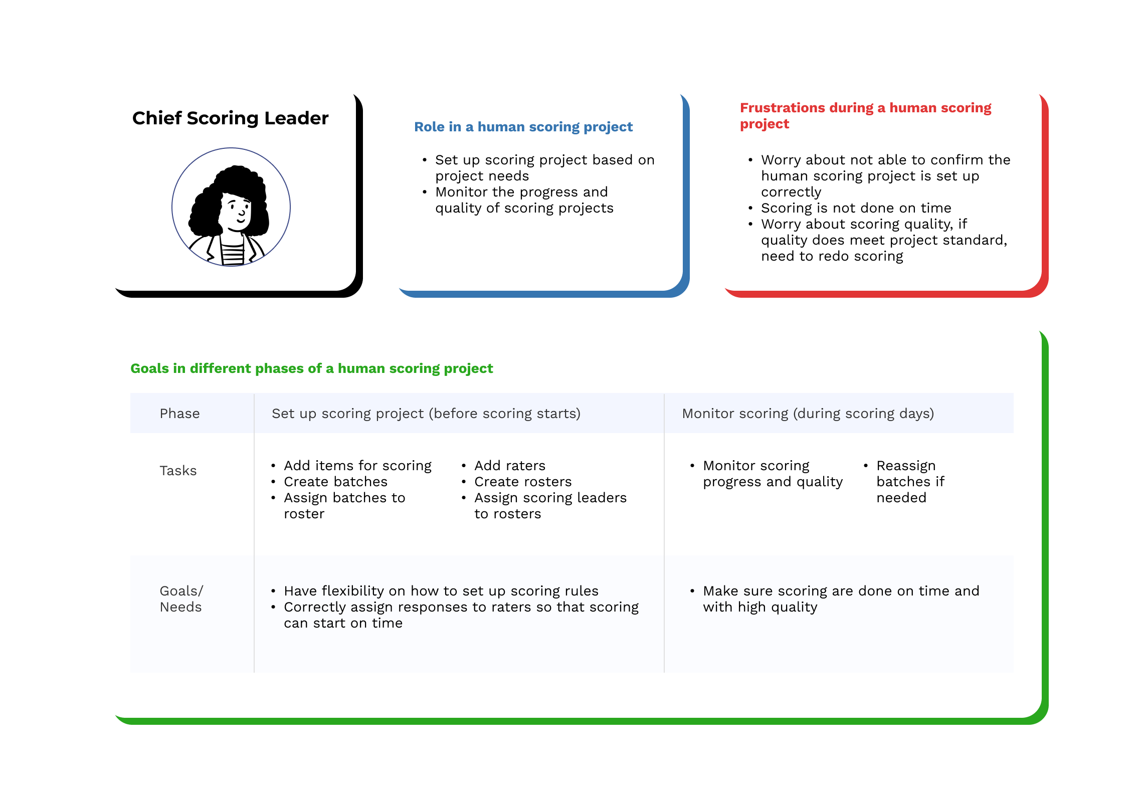
For each of the key Chief Scoring Leader need, here are what I designed to fulfill their needs.
Users need flexibility on setting up scoring rules. One important scoring rule is the scoring label. Scoring labels refer to the different score options for raters when they score a response. (see below in square)

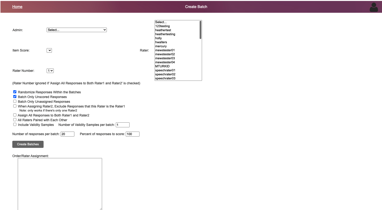
Previous design only has one page for this complex workflow. Everything else can only be done by developers.
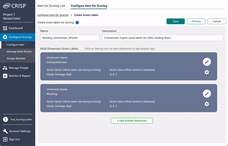
After my redesign: Each human scoring project might include assessment questions with different scoring labels. With the new design, users can easily set up the scoring labels and see them altogether at a glance.
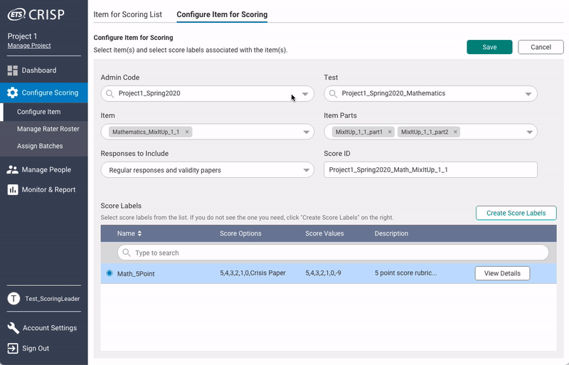
After my redesign: Users also need flexibility in setting up scoring labels so that they can show certain scoring labels based on the selection of a previous scoring label. I designed the setting up display logic feature so that users' needs can be fulfilled. My design also made sure users are informed of what they set up.
Previous design for assigning responses to raters only have one screen, even our developers find it confusing and hard to use.
After my redesign: Users need to correctly assign responses to raters so that scoring can start on time. I break down this process into 5 steps to minimize cognitive loads and guide users through this process so that they can finish it easily and quickly.
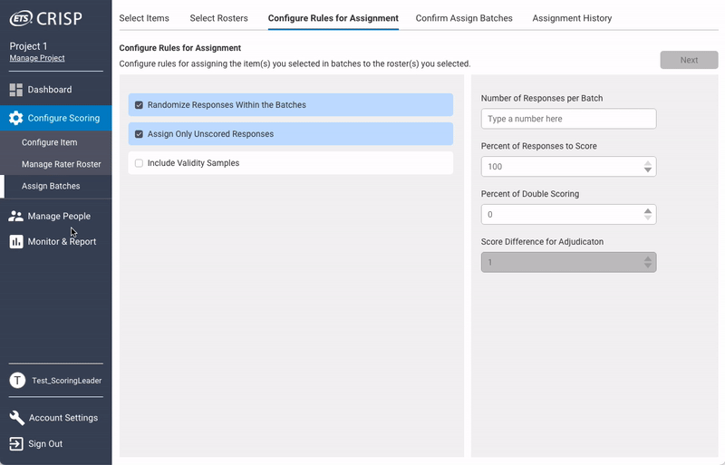
After my redesign: The design includes a review page and a double confirmation pop-up to minimize the possibility of user error and inform users of the result of their actions.

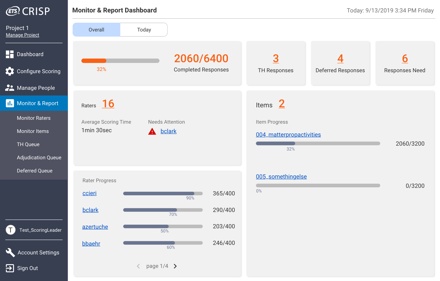
During an ongoing scoring process, the Chief Scoring Leader needs to monitor the progress and the quality of scoring to ensure: (i) the scoring be done on time; and (ii) high quality of the scoring data.
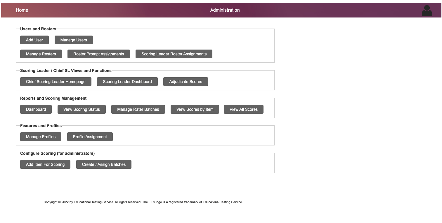
The previous design (as shown below), provide some information for Chief Scoring Leader, but not all that they need. I learned during an ongoing scoring, if Chief Scoring Leader need access to those information, they need to email our developers to get it, which may result in delay or even failure of the project.
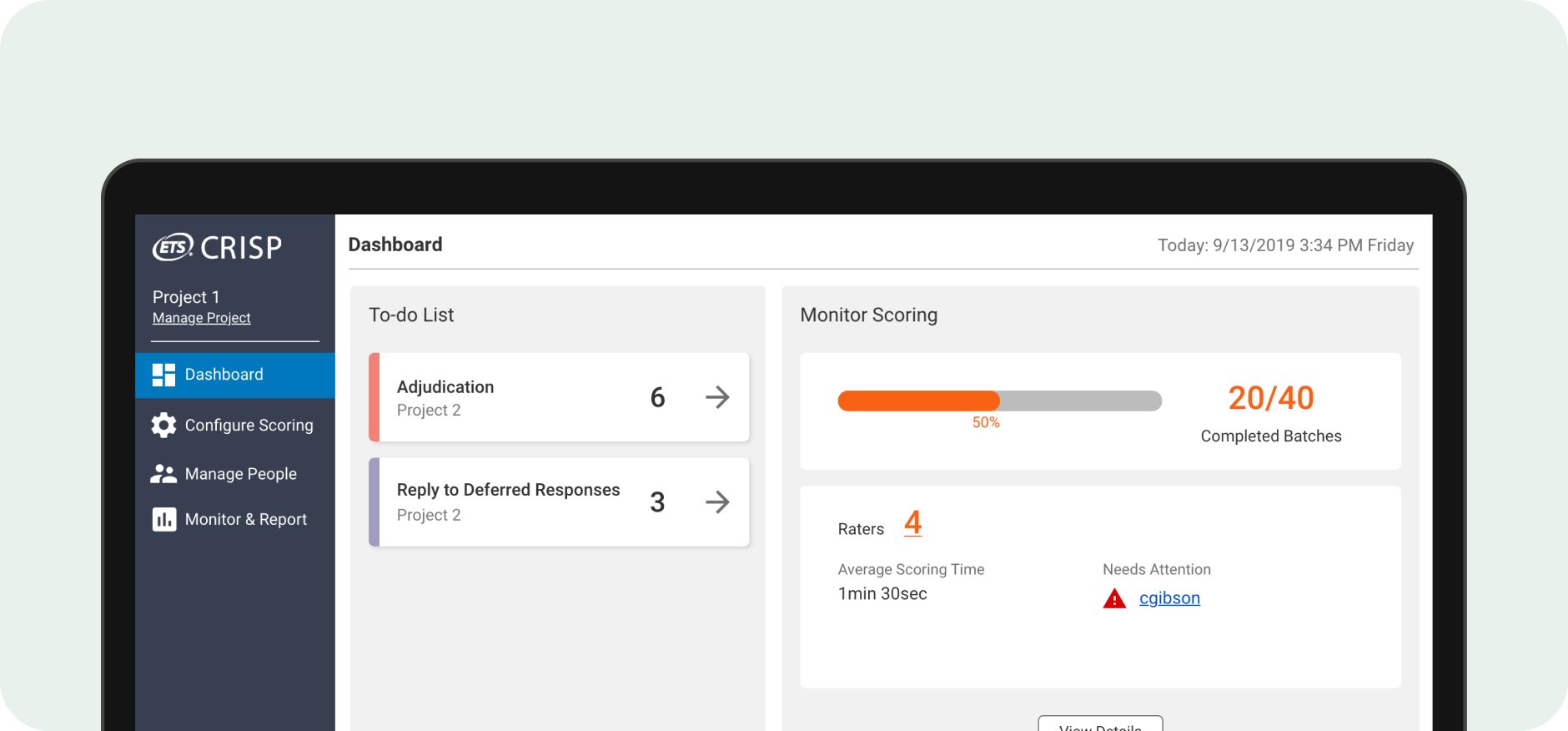
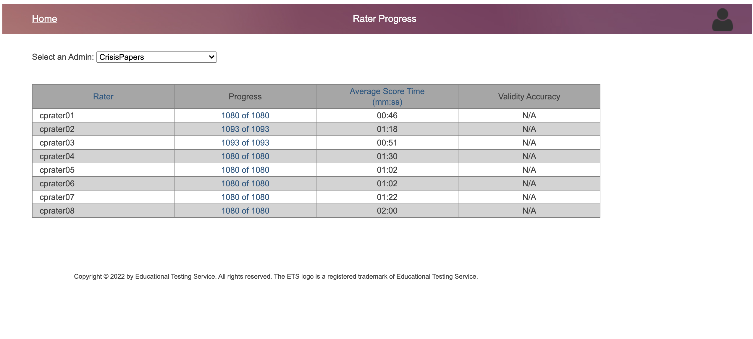
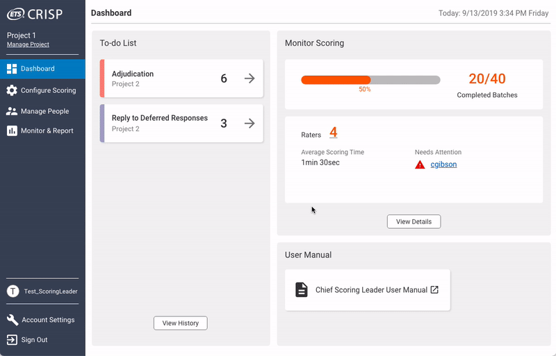
After my redesign: My new design include a simple dashboard that highlight key information they need access to during scoring. They can also access more detailed information on different screens.
My redesign was quite successful. During one round of usability testing on the Chief Scoring Leader portal with 5 potential users, they reached a success rate of over 90%. In a survey following the usability testing, users rated "very easy to use" for most features of the new design.

As one of the first UX designers on the team, I made most of the plans on how to tackle this redesign problem on my own. The design impacts of this project are:
